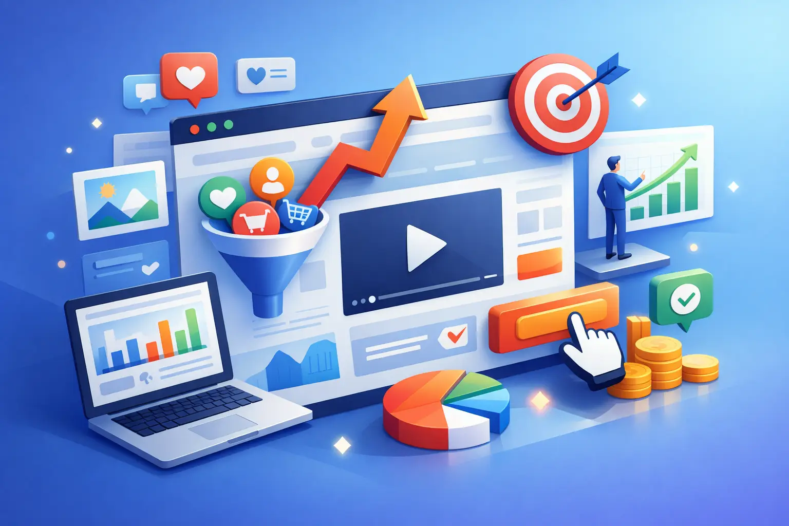
Conversion Focused Web Design That Wins
A website can look polished, load quickly and still fail at the one thing the business actually needs - generating enquiries, sales or qualified leads. That is where conversion focused web design changes the conversation. It shifts the brief from 'make us look better online' to 'build a website that helps us win more business'.
For startups, SMEs and established firms alike, that distinction matters. A site is not a digital brochure. It is a sales tool, a lead qualification tool and, in many cases, the first serious touchpoint a prospect has with your business. If it attracts traffic but does not turn that traffic into action, it is underperforming.
What conversion focused web design really means
Conversion focused web design is the practice of designing a website around commercial outcomes rather than aesthetics alone. That does not mean design becomes secondary. It means design has a job to do.
Every layout decision, message, navigation label, form field and call to action should help a visitor move towards a meaningful step. That step might be a phone call, a quote request, a booked consultation, a demo, a purchase or a download. The right conversion depends on the business model, the sales cycle and the value of the lead.
This is where many websites fall short. They are built around internal preferences instead of user behaviour. Teams spend weeks discussing colours and homepage banners, while far less attention goes to trust signals, page hierarchy, user intent or what happens after someone clicks a button. The result is a site that looks fine in a boardroom review but performs poorly in the real world.
Why design alone is not enough
There is a persistent myth that better visuals automatically produce better results. Sometimes they help, but only when they support the wider journey.
A sharp visual identity can improve credibility. Good photography can raise perceived quality. Clean layouts can reduce friction. But none of those things guarantee more conversions if the offer is unclear, the messaging is vague or the next step feels like hard work.
That is why the strongest websites sit at the intersection of design, strategy, content and technical delivery. If your website team is only thinking about appearance, you will almost certainly miss commercial opportunities. If they only think about lead generation and ignore brand perception, you risk creating something pushy, generic or forgettable. The balance matters.
The best-performing websites remove doubt
People rarely convert because of one clever headline. They convert because enough questions get answered, enough concerns are reduced and the path feels straightforward.
A prospect might arrive with doubts about price, quality, timescales, reliability or whether you understand their sector. Good design helps resolve those doubts quickly. It places proof in the right places, gives users context before asking them to commit and makes the next step feel proportionate to their intent.
A visitor looking for a local service may be ready to call today. A buyer researching a six-figure solution probably is not. Conversion focused web design accounts for both.
The commercial building blocks of a high-converting website
The most effective websites tend to share a few core traits. Not because they follow a trend, but because they respect how people make decisions.
Clear messaging above the fold
Within seconds, users should understand what you do, who you do it for and why they should care. If your homepage headline could apply to almost any company in your sector, it is too vague.
Strong messaging is specific. It gives visitors immediate orientation. It also avoids forcing them to scroll through generic claims before they find anything useful. Clarity nearly always outperforms cleverness.
A structure built around user intent
Not every visitor wants the same thing. Some need reassurance. Some want pricing. Some are comparing suppliers. Some simply need contact details. A conversion-led website recognises those different journeys and makes them easy to follow.
That affects navigation, internal page structure and the order of information on key landing pages. It also means resisting the urge to overload pages. More information is not always more persuasive. Often it just creates noise.
Calls to action that match buying intent
A common mistake is asking for too much too soon. If someone has just landed on your site from a search, they may not be ready for a hard sell. Equally, if they are clearly high intent, burying the enquiry option under three layers of navigation costs leads.
Effective calls to action are placed with purpose. They also match the value and complexity of the offer. A low-friction action such as 'Request a callback' may outperform 'Book a full consultation' in some sectors. In others, the opposite is true. It depends on what feels natural to the buyer.
Trust signals in the right places
Trust is not built on a testimonials page nobody reads. It is built across the whole site.
That includes reviews, accreditations, case study evidence, client logos, clear contact details, sector experience, team visibility and any proof that your business delivers what it promises. These elements work best when they support moments of hesitation. Put another way, trust signals should appear where doubt is likely to appear.
Fast, stable and mobile-friendly performance
Slow websites lose conversions. So do websites that jump around while loading, break on mobile or make forms awkward to complete on a phone.
This is not just a technical issue. It is a commercial one. If a prospect is ready to enquire and your form is frustrating, your competitor benefits. Conversion rates often improve not through dramatic redesigns but through fixing these practical barriers.
Conversion focused web design needs measurement
If you cannot see what your website is producing, you cannot improve it with confidence.
Too many businesses still judge website performance by surface-level numbers such as page views or general traffic increases. Those metrics have their place, but they do not tell you whether the site is creating revenue opportunities.
A better approach tracks meaningful actions. That includes form submissions, phone calls, booked meetings, e-commerce actions and, crucially, lead quality. A campaign that generates fifty irrelevant enquiries is less valuable than one that brings ten strong opportunities.
This is where the wider digital system matters. Design should not be disconnected from reporting, CRM workflows or call tracking. If your website generates leads but nobody can attribute them properly, optimise them effectively or connect them to sales outcomes, you are only seeing part of the picture.
Good data changes better decisions
Once proper tracking is in place, weak points become easier to spot. You can see which landing pages convert, where users drop off, which traffic sources produce better leads and whether certain calls to action are underperforming.
That turns web design from a one-off project into an ongoing commercial asset. It also prevents costly redesign decisions based on opinion alone.
Where businesses often go wrong
Most underperforming websites do not fail because of one major flaw. They fail because of a stack of smaller issues.
Sometimes the problem is positioning. The site talks too much about the business and not enough about the client's problem. Sometimes it is poor page hierarchy, where key information sits too far down. Sometimes it is weak mobile performance, overcomplicated forms or copy that sounds polished but says very little.
There is also the issue of disconnect. A business might invest in SEO, paid media or social campaigns, yet send that traffic to pages that are not built to convert. In that situation, media spend works harder than it should. The leak is not always in the traffic strategy. Often it is on the page itself.
Why conversion focused web design is a strategic decision
For commercial decision-makers, this is not really a design debate. It is an efficiency debate.
A stronger website can reduce wasted ad spend, improve lead quality, shorten the sales journey and make better use of existing traffic. It can help smaller businesses compete more effectively and give established firms a cleaner, more credible platform for growth.
That is why the best projects begin with questions about goals, buyers, margins and lead handling - not just layout preferences. If the objective is measurable growth, the website has to be shaped around what growth actually looks like for that business.
For some, that means more calls from local prospects. For others, it means fewer but better enquiries from higher-value clients. A conversion-led approach does not force every business into the same model. It aligns the site with the right commercial outcome.
Blended Digital works with this principle in mind: the website is only doing its job when it contributes to visibility, lead generation and measurable return.
What to ask before your next website project
If you are planning a new site or reviewing an existing one, the key question is not whether it looks dated. It is whether it is helping the business move forward.
Ask what action matters most. Ask what might be stopping users from taking it. Ask whether your pages answer the real questions buyers have, whether your mobile experience is genuinely usable and whether your reporting shows outcomes rather than assumptions.
A website should not just represent the business. It should support it commercially, day after day, with less friction and more intent. When design, messaging, technology and tracking work together, conversions stop feeling unpredictable. They become something you can improve with purpose.
The most valuable websites are not the ones that win internal praise on launch day. They are the ones that keep earning their place in the business long after launch, because they turn attention into action.
Date Published: 23/04/2026